Introduction to PacSAFE
Introduction
This session will introduce the InaSAFE application to participants. We will guide you through the process of installing InaSAFE, walk you through the main interface and demonstrate some basic operations you can perform in InaSAFE.
Learning objective
To introduce participants to the process of installing InaSAFE and basic functionality and navigation in the application. By the end of this exercise, participnts will:
- Understand how to install PacSAFE
- Explore the PacSAFE toolbar and functionality
- Learn basic operations in PacSAFE
Data for this exercise
No data is needed for this exercise. The facilitators will provide the InaSAFE application.
Exercises
Getting PacSAFE
PacSAFE can be downloaded from http://services.gsd.spc.int/pacsafe/
For this workshop, we are providing the whole PacSAFE application via a USB key, along with the required datasets for the scenarios that will be explored.
Installing PacSAFE
Copy the contents of the USB to a location on your computer, extract the files and run the installer.
Starting PacSAFE
Start InaSAFE by double clicking the InaSAFE icon on the desktop.
A splash screen will appear for a few seconds, then the main InaSAFE interface will be displayed.

Understanding the InaSAFE interface
InaSAFE is based on the Geographic Information System (GIS) software package QGIS and the InaSAFE plugin. The main InaSAFE interface uses the QGIS interface, with a reduced number of toolbars to make the interface easier to navigate for non-specialists.
There are four elements in the PacSAFE interface:

- Layers panel: On the left side of PacSAFE is the layers panel. This panel lists the layers, or files, that are loaded into our PacSAFE project. The Layers Panel not only shows all the files that are currently open, it also determines the order that they will be drawn on the map canvas. A layer that is at the bottom of the list will be drawn first, and any layers above it will be drawn on top.
- Toolbar: At the top of PacSAFE are a large number of tools, which are contained within various toolbars. For example, the File toolbar allows you to save, load, print and start a new project, under the Project and Plugins dropdown menus. We already used one of these tools when we opened this project. By hovering your mouse over an icon, the name of the tool will appear to help you identify each tool.
- Map canvas: All of the map data that we load into PacSAFE will be displayed here, both vector data and raster data.
- PacSAFE dock: After successfully opening PacSAFE, you should have a PacSAFE dock on the right hand side of the screen. It should look like this:
Screenshot of PacSAFE dock
PacSAFE basic tools
We’ve already taken a look at the QGIS toolbar and have seen the tools for opening QGIS. Here’s a list of some of the most commonly used tools. Feel free to play around with them if you like. The important thing for now is to start getting familiar with QGIS.
The InaSAFE button gives you access to the pre-compiled projects delivered with InaSAFE. Clicking on the InaSAFE button will open a new window with a list of projects to select from.
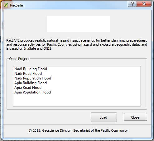
Fig. 5 Project selection window for PacSAFE.
Select the “Nukualofa tsunami buildings” project in the list, then click the Load button.
The project will show several layers in teh Layers panel, including:
- Buildings: this is the exposure data. This will be used to assess the tsunami impact on buildings.
- Tsunami: this is the hazard data. It is used to determine the inundation depth from a tsunami.
- Imagery: this is contextual data, and is aerial imagery over Nuku’alofa. This provides a sense of place and scale when viewing the results of analysis. It is not used in the analysis.
Navigating the map
Before we examine the attributes of individual features, let’s take a quick look at how to navigate the map. The main controls for moving the map around and zooming in-and-out are on the panels at the top of QGIS by default.
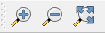
When you click on one of these buttons, it changes the action of the mouse in the main map window.
- Select the first button that looks like a hand. Now hold the left mouse button down and drag the mouse in the map window. This allows you to pan the map, or move it around.
- Selecting the button that has a plus sign (+) inside a magnifying glass allows you to zoom in on the map. Using your mouse, draw a boz around your area of interest and release your mouse.
- Selecting the button with a minus sign (-) inside a magnifying glass allows you to zoom out on the map. Select this button and click on the map.
- The button that looks like a magnifying glass with blue arrows pointing away from it lets you zoom to the full extent of your map. Click this button to see all the data that is loaded in the project fit into the map canvas.
Hide and move layers
Sometimes if you handle many layers, you need to hide/unhide layers to make the map canvas more organized. For example, open the pre-saved QGIS project, DKI_Jakarta_Introduction.qgs. Once all the data are displayed on your map canvas, try toggling the layer, Tsunami from a Mw 9.0 earthquake by clicking on the checkbox in the Layers Panel on the left side of your screen.
After you uncheck the check box, the layer will disappear from the map canvas. This operation won’t remove your layer from the layers list but only hide it temporarily until you recheck again the check box. Try to turn ON the layer again to unhide the layer.
What if your layer does not appear in the map canvas even though you already turned ON your layers? In this example, the Jakarta_roads_WGS84 layer didn’t appear in Map Canvas even though it’s already turned ON. In this case, it’s related to layer order. The layers in your Layers List are drawn on the map in a certain order. The layer at the bottom of the list is drawn first, and the layer at the top is drawn last. By changing the order of the layers in the list, you can change the order they are drawn in.
Symbolize a layer
The symbology of a layer is its visual appearance on the map. One of
the basic strengths of GIS is that you have a dynamic visual
representation of the data you’re working with. Therefore, the visual
appearance of the map (which depends on the symbology of the
individual layers) is very important. For example in the project that
you currently have open, DKI_Jakarta_Introduction.qgs, you
will see the A Flood in Jakarta like 2013 layer covering the area
of DKI Jakarta. Did the flood really cover the whole of DKI Jakarta?
To answer this, let’s turn OFF the Jakarta_roads_WGS84 and A Flood Similar to the Jakarta 2007 event layers and open the attribute table of A Flood in Jakarta like 2013 by right clicking the layer and selecting Open Attribute Table. You will see there are 6 columns in this table and one of the columns has the name ‘affected’ with values of 1 and 0. A value of 1 represents an area that is flooded, while a value of 0 represents an area that has not been flooded. Let’s select a feature in this layer and see the highlighted feature in the attribute table.
What is the value of the selected feature in the attribute table?
Not all of the features in this dataset have a value of 1 (or flooded). You need to see which features have a value of 1 to make it easier to interpret the hazard area. To solve this problem, we will symbolize the data so it will only shows the flooded area.
- Right click on the A flood in Jakarta like 2013 layer and select Properties.
- Go to the Style tab and and change Single Symbol into Categorized.
- Select affected in Column as the column that we will use to categorize the data.
- Click classify and turn off the values that have a value of 0 or no value.
- Click OK
PacSAFE toolbar
PacSAFE also comes with a toolbar of it’s own! To retrieve the PacSAFE toolbar, you can right-click on the top toolbar and check PacSAFE.

|
PacSAFE Dock |

|
Set Analysis Area |

|
Toggle Scenario Outline |

|
Keyword Creation Wizard |

|
Impact Function Centric Wizard |

|
OpenStreetMap Downloader |

|
Add OpenStreetMap Tile Layer |
Later, we will explore and use these tools in Run basic PacSAFE and Intermediate modules.
Summary
In this exercise you have learned about QGIS, the free and open source software for processing spatial data. You have learned where to get QGIS, how to install QGIS, understand the QGIS layout and looked at some useful toolbars, learning how to turn ON/OFF QGIS layers, and learned how to symbolize the data layers.